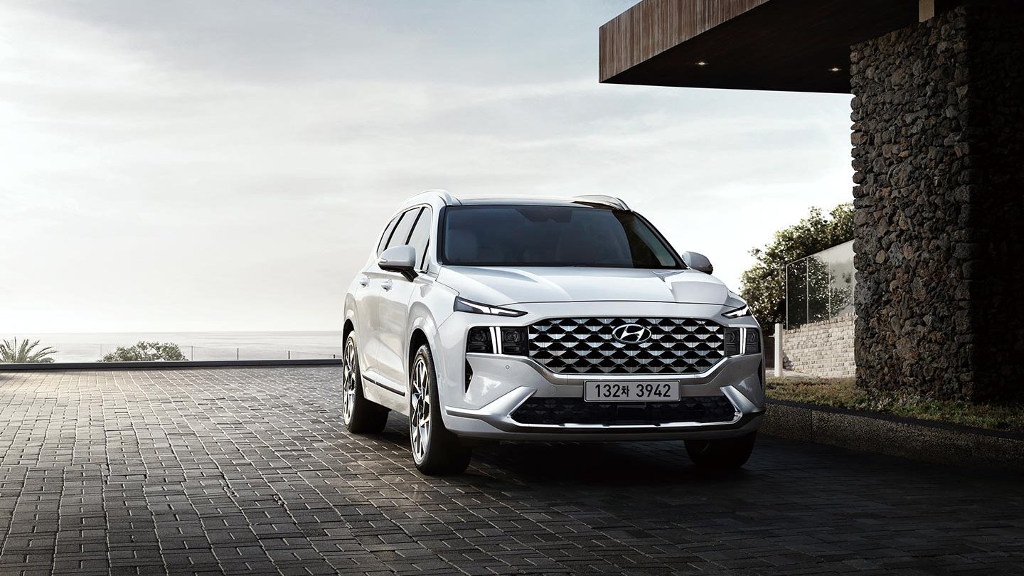
The New Santa Fe is a facelift model of the fourth-gen Santa Fe(TM) created in Europe. With its firm and luxurious looks based on ‘Sensuous Sportiness’, the vehicle features innovative changes in design. Thomas Buerkle, Head Designer, Eduardo Ramirez, Exterior general manager, Roberto Kuehn, creative manager, Alex Ekimov and Nicolas Deangel, senior designers, and Philip Fareschbandi, senior CAS modeler revealed the details of the design elements.
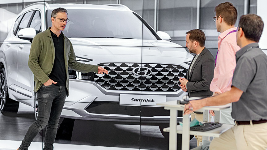
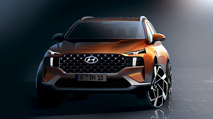
Q. Tell us about the design theme.
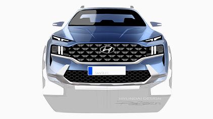
To create the confident, muscular stance mixed with delicate style, the New Santa Fe features sophisticated design elements based on the theme ‘Sensuous Sportiness’. Its slimmer synthetic surroundings and the rich surfaces and volumes contribute to the high-quality look. The dynamic character of the car’s ‘integrated architecture’ is further enhanced by a wider grille and headlamps creating the impression of stability. The T-shaped Daytime Running Lights (DRL) definitely becomes the vehicle’s unique light signature.
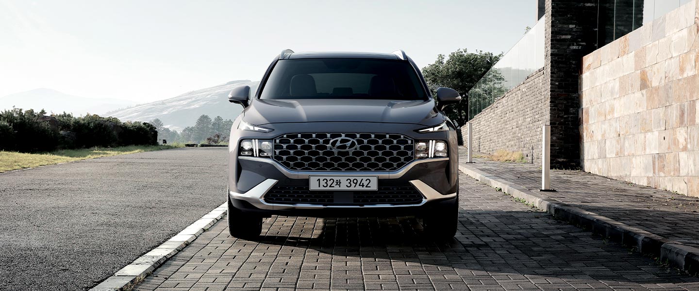
T-shaped Daytime Running Lights (DRL) represent bold mood of the SUV.
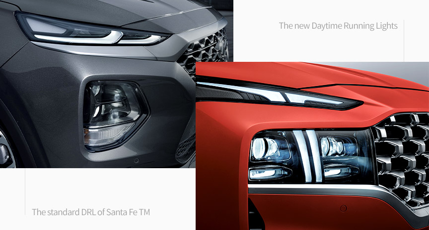
Q. There were a lot of comments about the T-shaped DRL when the teaser image was released. Tell us how you designed it.
Since headlamps make the first impression of a car, we wanted to make them look bold and strong as ever. So the headlamps would be the part where we changed the most for this facelifted model. Through the ‘Integrated architecture’, the New Santa Fe’s face introduces the grille that is complemented by the lights. The sculpted garnish that connects the DRL with the front grille emphasizes the width and powerful stance. In this way, it adds a lot of character to the car’s front making it more imposing than the predecessor.
To make the SUV look as tough as possible, we created the lights with sophisticated details that can go well with the vehicle’s bold character. For its new look, the New Santa Fe embraced a new, wider radiator grille that links to the daytime running lights, which have also been redesigned to embed a sharp “T” shape drawn in the concept of an eagle’s eye. This would make the New Santa Fe even more recognizable on the streets.
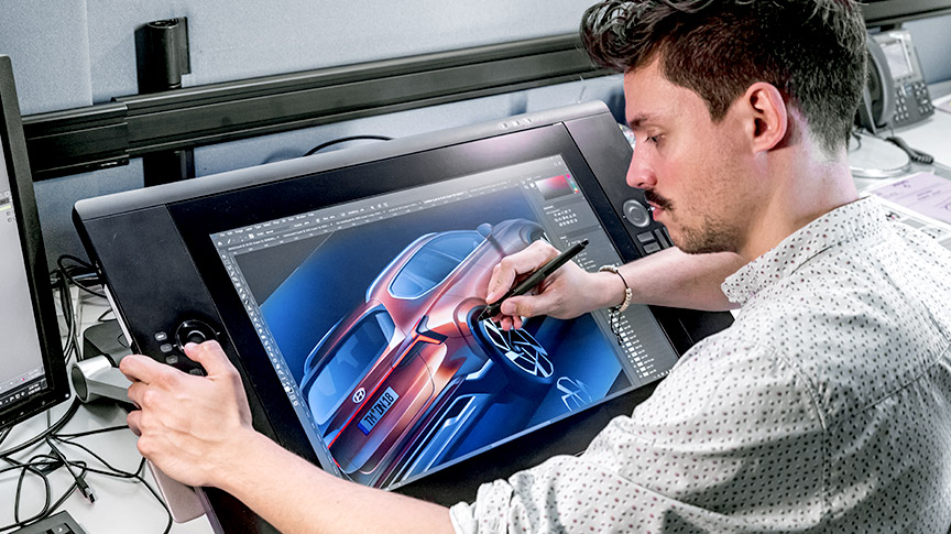
Hyundai Europe Design Center gave the New Santa Fe much more refined and modern looks.
Q. Why was the design created in Europe?
As Santa Fe was a global model, the design needed to be created globally, as well. The Fourth-gen Santa Fe and the New Santa Fe were created in Hyundai Motor Company Europe Design Center, through various global teamwork. This was why we had no problem designing its facelifted model, its tech features, and the new design.
The New Santa Fe evolved through the American Design Center where bold SUVs are born, the Europe Design Center where sophisticated details are born, and the Namyang Design Center where the innovative architectures are born. With bold lines and curves, the New Santa Fe could feature more powerful and elegant looks than its predecessor.
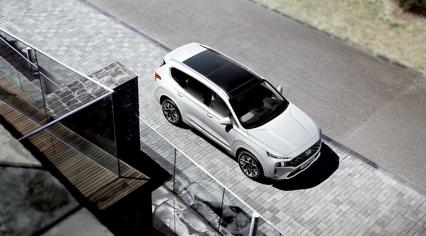
The designers aimed to create an SUV that could be loved worldwide.
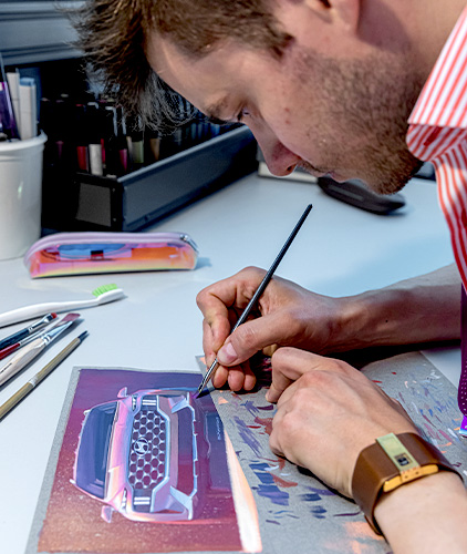
Q. Did you make the design more European-friendly?
We designers did not just focus on what Europeans would want. We aimed to create a vehicle that could be loved worldwide. Especially, South Korea and the U.S. are the countries where Santa Fe is very much popular. So, when we made this facelift model two years after the original release, we tried to make it look much bolder and futuristic this time. In the meantime, however, we tried to make this signature Hyundai SUV look luxurious and premium in the European market.
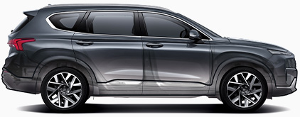
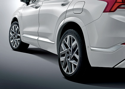
With the new platform, we used 20-inch aluminum alloy wheels and bolder wheel arch design.
Q. How did the new platform affect the design of this facelift model?
We changed a lot about this facelifted model, and this could be possible for the new platform we used. With its lower center gravity, the cabin got more space. One noticeable change inside the car is the center console. The exterior looks much different as well. With a 10-mm longer body, the sculpted garnish that connects the Daytime Running Lights with the front grille emphasizes the width and powerful stance. Another is that we used 20-inch aluminum wheels. In this way, it adds a lot of character to the car’s front making it more imposing than the predecessor.
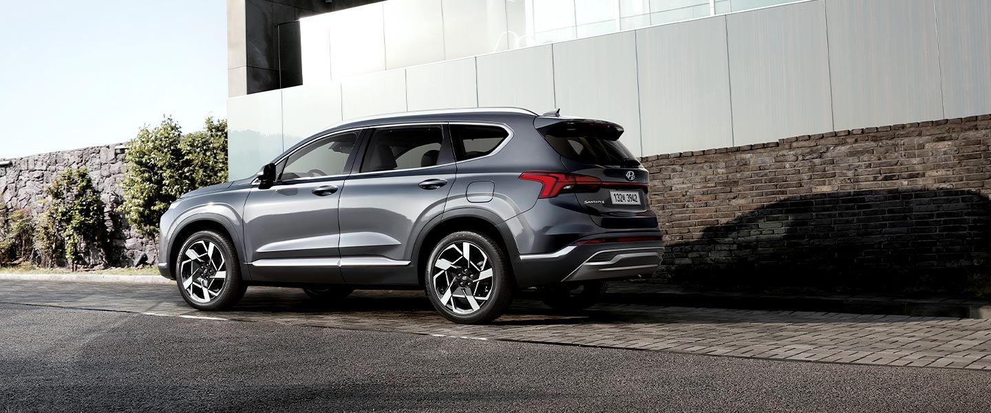
The horizontal lines that run along the roofline feature the New Santa Fe’s stabilized stance.
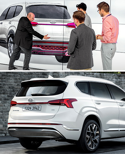
Q. What would be notable among the rear design elements?
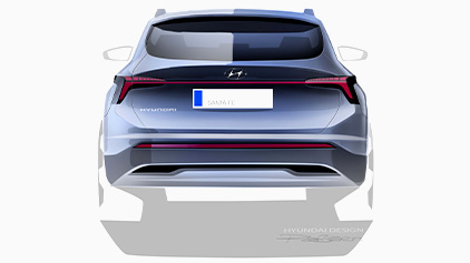
The rear creates a confident stance with a striking bumper design and horizontal taillights. We made both the reflector and the skid plate underneath it look horizontal, connecting with each other with long, thin lines. This is a common design factor that all Hyundai vehicles share. The character line is directly flowing into the corner of the backlight, giving the car maximum width.
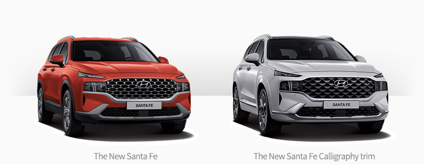
The highest Calligraphy trim features uniquely designed grille, fender garnish, bumper, and color.
Q. What’s so special about the highest Calligraphy trim?
Just like Grandeur and Palisade, the New Santa Fe also has the highest Calligraphy trim among other options. We used many high-quality parts and design elements for this trim. For starters, the geometric pattern on the radiator grille and air intake symbolize modern and high-end looks. Also, the bumper, fender garnish, and the rest of the body are painted with the same color, emphasizing the trim’s simple yet luxurious looks. The uniquely designed 20-inch wheels maximize the ideal design.
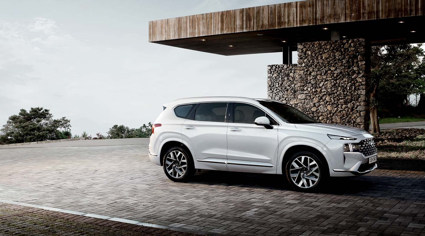
The new platform made it possible for the New Santa Fe to change its design elements.
Q. What would be the most attractive factor of the New Santa Fe?
Among the high-quality powertrain and high-tech features, the new platform would be the most fascinating part of this vehicle. Since a platform is the foundation of a car, we could try bold designs with the brand-new platform. Ideal proportions, stable looks, T-shaped DRL, bold-looking radiator grille, 20-inch wheels, and sporty-looking rear diffusor all represent the vehicle’s unique looks. Not only the driver but also pedestrians who encounter the New Santa Fe will adore the bold yet mature looks.
